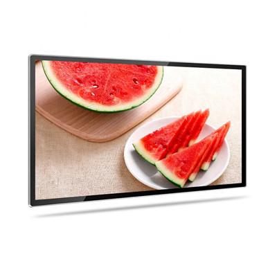
Minimalist poster frames offer simple elegance and a clean aesthetic that can enhance the visual impact of your posters while complementing a modern and uncluttered decor style. Here are some tips for achieving minimalist elegance with poster frames:
- Select Neutral Colors: Choose frames in neutral colors such as white, black, gray, or natural wood tones. These colors blend seamlessly with various interior design themes and provide a timeless look.
- Sleek and Thin Profiles: Opt for frames with sleek and thin profiles. Minimalist frames are characterized by their simplicity, and thinner profiles emphasize the poster’s content without overwhelming it.
- Matte Finishes: Consider frames with matte finishes rather than glossy ones. Matte finishes reduce glare and create a more subdued and understated appearance.
- Straight Lines and Sharp Corners: Look for frames with straight lines and sharp corners. These geometric shapes align with minimalist design principles and create a sense of order and simplicity.
- Consistent Frame Width: If you have a collection of posters, maintain a consistent frame width for all of them. This uniformity contributes to a cohesive and visually pleasing display.
- Frameless or Floating Styles: Frameless or floating frames, which typically use clear acrylic or glass panels, provide an ultra-minimalist look. They create the illusion that the poster is suspended in the frame, adding a touch of modern elegance.
- Monochromatic Palette: Consider using a monochromatic palette for both the frames and the posters. For example, frame a black and white poster with a black frame for a minimalist and harmonious effect.
- Conservative Matting: If you use matting, keep it minimal by choosing a neutral color that complements the poster without distracting from it. Consider single matting for a clean look.
- Spacing and Alignment: Ensure the posters are evenly spaced and aligned on the wall. Use a level and measuring tape to achieve precise placement.
- Limit Clutter: Avoid overcrowding the space with too many framed posters. In minimalist design, less is often more, so select a few carefully chosen posters to display.
- Uncluttered Presentation: Remove any unnecessary text or information from the posters themselves. This maintains a clean and uncluttered presentation.
- Mindful Content: Choose posters with minimalist or abstract designs, simple typography, or clean lines to complement the minimalist frame style.
- Focus on Balance: Balance is key in minimalist design. Arrange the framed posters in a balanced and visually pleasing layout on the wall.
- Use Negative Space: Allow for ample negative space around the framed posters. This emphasizes the elegance of the frames and the importance of the poster content.
Minimalist poster frames create a sense of serenity and sophistication while putting the spotlight on the artwork or messages you wish to display. They work well in various settings, from living rooms and bedrooms to offices and galleries, where simplicity and elegance are valued.


